Expedia Group · via EPAM · 1 year
Home Personalization
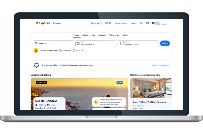
The Expedia homepage is the central hub of the traveller experience — discovery, planning, booking, travelling and reflecting all begin there. It treated every visitor the same. I rebuilt it into a personalisation framework that responds to who the traveller is and where they are in their trip.
- $1.3M
- Annual gross profit — Package Collections on Home
- $690K
- Themed Destination Recommendations, web and native
- $562K
- Showing average lodging prices in recommendations
- $420K
- Contextualising property recs with destination names
What the homepage was doing wrong
Expedia Group operates a portfolio of travel brands — Expedia, Hotels.com, Vrbo, Travelocity, Orbitz and others. The homepage is a crucial entry point for both prospective and returning customers, and it was the least intelligent surface in the product.
It carried no dynamic, contextual content. It did not reflect an individual traveller's interests or behaviour, which cost conversion and engagement, and missed repeated opportunities to increase customer lifetime value and strengthen brand trust.
In its existing state the homepage did not differentiate between travellers still planning a trip and travellers already travelling. That produced three compounding problems: frustration from irrelevant content, drop-off from cognitive overload, and missed upsell and re-engagement moments.
What it needed to become was a flexible, scalable personalisation framework spanning mobile and web, balancing business rules against machine-learning intelligence.
The business goals:
- Drive monetisation through a higher conversion rate
- Boost retention with personalised recommendations
- Increase engagement through smarter content organisation
- Strengthen brand perception through contextual relevance
Research
6 travellers · interviews + prototype testingThe team ran sessions with six travellers who were either actively planning a trip or had one booked. Each session had two halves: an interview about decision-making, travel choices and points of interest, followed by comparative testing with high-fidelity prototypes across multiple trip scenarios at different planning stages.
Six is a deliberately small, directional sample — it was never the basis for a launch decision. Its job was to explain why travellers disengaged. Every change it pointed to then shipped behind experiments measured across live homepage traffic, which is where the revenue figures on this page come from.
“I'm not an impulse traveler, sometimes it feels like the page gets busy with things I'm not interested in.”
Participant · P1
“There's nothing really specific about my trip. It's all just inspiration stuff.”
Participant · P2
“While I appreciate the inspiration, I don't use it. I know where I want to go. You're not going to find me going all the way down here.”
Participant · P3
“Feel like there's not a whole lot of suggestions of what to do in these places — it's all just based on hotels.”
Participant · P4
Key findings
- Four of six travellers were delighted when the page showed recently searched destinations alongside new, relevant discovery content — it motivated them to carry on planning.
- Seeing their most recent bookings on the homepage made immediate sense, and did not stop them exploring new destinations.
- When exploring options, travellers wanted to learn about the destination, especially the activities available there — not just see more hotels.
- Travellers appreciated content that adapts to where they are in their journey, and the ability to plan multiple trips to different destinations at once.
- They were willing to answer post-trip questions if it produced a more personalised experience afterwards.

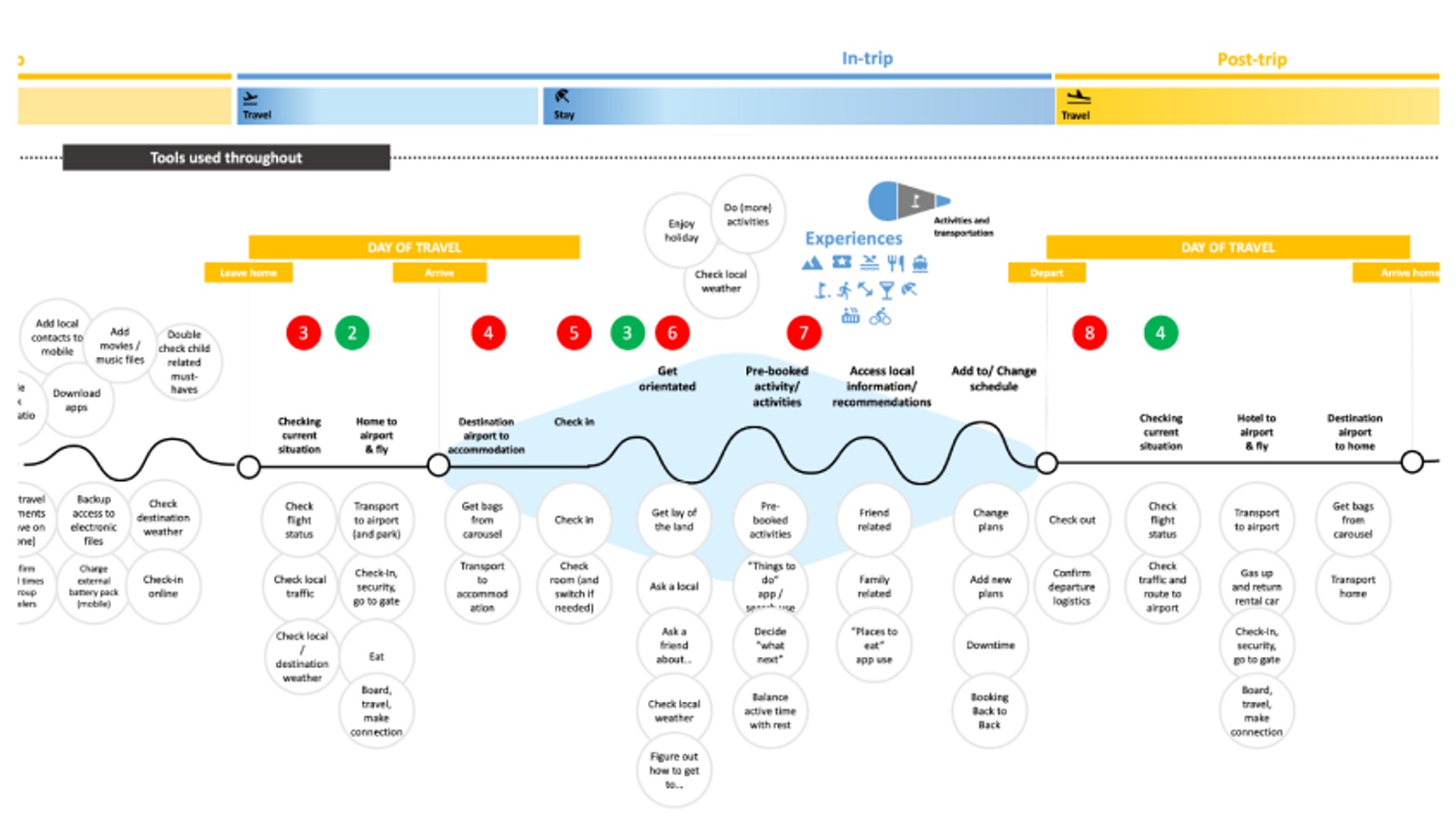
Mapping the traveller journey
The journey map sets out the stages of a traveller's lifecycle — discovery, planning, booking, pre-trip, in-trip and post-trip — and became the spine for content, feature and UX decisions. Its purpose was to make sure the homepage delivers the right value at the right moment, rather than the same value always.
Information architecture
With the stages agreed, I mapped the homepage itself — the site header, the search bar, and every module in the main content, down to the individual elements inside each card. Naming each element is what turned module ordering into an explicit decision the team could argue about, rather than whatever the template happened to do.

Design strategy
Working with the product manager and engineering team, I planned a multi-phase rollout: foundational improvements first, then home contextualisation, and finally recommendations for a traveller's upcoming trip.
Audience segmentation
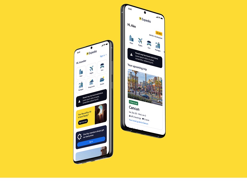
I designed distinct home experiences for two traveller states:
- Cold start (unauthenticated) — an exploratory layout focused on discovery, showing the breadth of what Expedia offers.
- Warm start (authenticated) — a personalised layout optimised for progression through the travel journey, with smart recommendations.
ML-centric personalization
Contextual recommendations & collectionsTo raise the value of the homepage and increase engagement, we introduced and then iterated on personalised recommendations and a collections UI.
The hypothesis: revamping recommendations and collections with a visually immersive layout and curated content — tailored to user activity signals — would improve both engagement and conversion across lodging, activities and package bookings.
The aim was to inspire cold-start travellers with high-appeal, shoppable content, and re-engage warm-start travellers by surfacing action-driven modules based on recent behaviour. Blending data-driven intelligence with a striking, intuitive interface was meant to drive qualified visits, improve conversion, and reinforce Expedia's role as a useful travel partner rather than a search box.
What I built:
- Modular home components supporting personalised, contextual recommendations
- Position-aware modules that respond to user state — new versus returning travellers
- Business-rule logic governing module visibility and ordering
- ML-powered destination and product recommendations across lodging, flights, cars and packages
Home contextualization
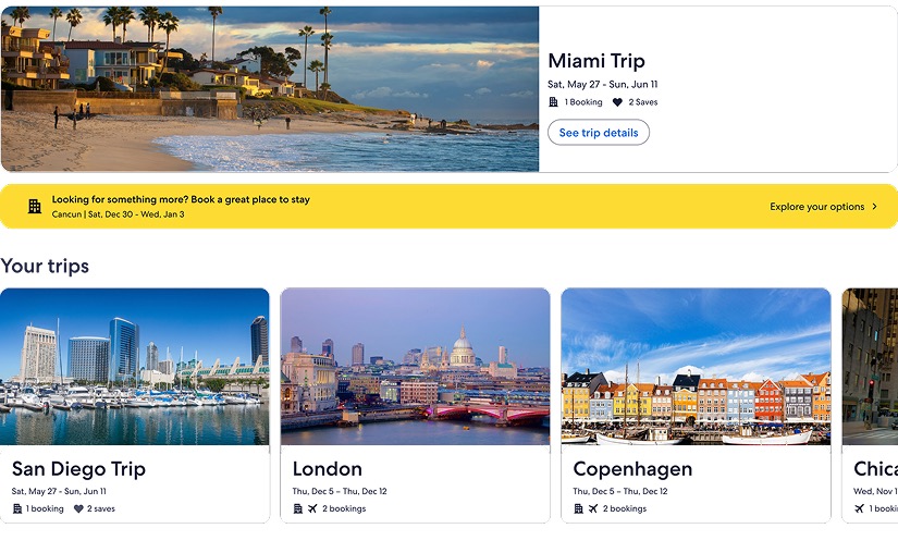
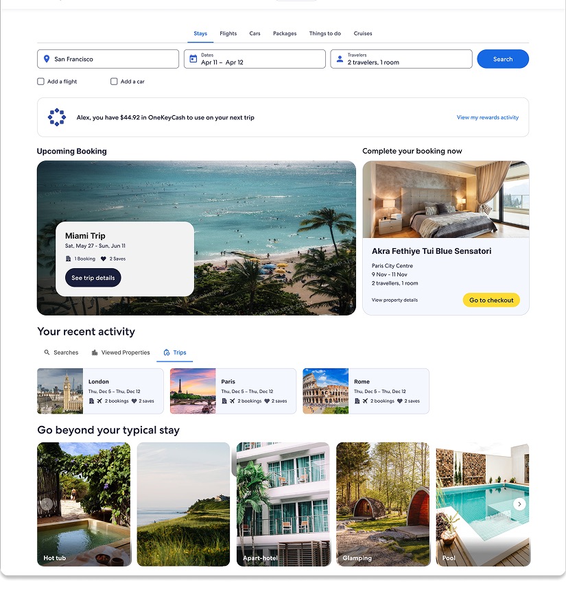
Phase 2Where phase one asked who the traveller is, phase two asked where they are in the trip. Home contextualization builds on the ML foundation to make the homepage respond to journey stage and destination intent.
The hypothesis: if the homepage identifies a traveller's journey stage and destination intent, and serves guided content for discovery, booking and the trip itself, it will increase feature engagement, lift conversion and strengthen loyalty — meeting immediate needs while establishing Expedia as a partner across the whole experience.
Personalisation ran on two dimensions:
- Profiles and preferences. Encouraging travellers to save preferences let us personalise by trip theme (family, luxury, adventure), trip type (road trips, city escapes), season, budget and distance.
- Context and behavioural signals. Analysing journey stage, location, recent activity and destination intent let us surface timely content at the moment it helps a decision.
We then mapped the homepage to six journey stages, each with its own content strategy:
- Discovery — seasonal themes, trending destinations, dream-now content
- Planning & shopping — resume recent searches, surface saved items, offer comparison tools
- Post-booking — reinforce confidence with trip summaries and upgrade suggestions
- Pre-trip — reminders, destination guides, weather, last-minute essentials
- In-trip — real-time support, local insight, itinerary management
- Post-trip — prompt reviews, share memories, show loyalty credits, inspire the next trip
Execution meant reorganising modules by traveller stage, using the personalisation engine as the single source of truth for context, tuning the models to reflect stage-specific intent, pruning redundant modules, and rewriting copy for relevance.
Also shipped
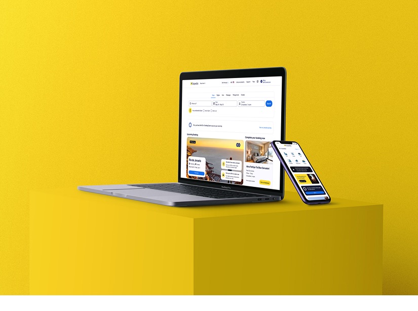
Two further initiativesTwo more initiatives shipped as part of the same programme. Both fed the personalisation work above — one gave travellers a way to steer it, the other used it to help them finish a trip they had already started booking.
-
Feedback loops
Expedia was scaling personalised features with no way for travellers to say whether they were working — the only signals were inferred from clicks and bookings, and weren't feeding model iterations. I designed explicit controls: hearting recommendations, module-level interested / not-interested, dismiss actions, and preference capture applied across the journey.
Transparency, control, and never repeating yourself -

Attach
69% of attach customers land directly on the homepage to keep buying for a trip, but only 12% of US travellers know attach savings exist. I designed a module that asks the ML model which line of business a traveller is most likely to book next, checks discount eligibility, and builds the offer from the result.
Anchored to a booked trip, with a countdown
How we measured it
Success was tracked across six dimensions, each with its own owner:
- Monetisation — conversion rate, order conversion rate, gross profit
- Retention — seven-day visit return rate
- Activation — authentication rate and app downloads
- Engagement — click-through from the homepage to search and property pages
- Perception — brand experience survey score
- Performance — largest contentful paint under 2.5 seconds on web, plus app time-to-interactive and response time
Outcomes
Personalisation and UX work translated into measurable business outcomes:
- $1.3M annual gross profit from adding Package Collections to Home
- $690K from Themed Destination Recommendations across web and native
- $562K from displaying average lodging prices within destination recommendations
- $420K from contextualising property recommendations with destination names
Alongside the revenue, the behavioural picture moved:
- Higher click-through rates into shopping pages
- Improved conversion on personalised content
- Higher engagement on the flight collection module after repositioning it
Reflection
This showed how personalisation at scale can lift user experience and business outcomes together. Blending ML intelligence with clear UX principles turned Home from a static entry point into a dynamic one for millions of travellers.
What it reinforced for me:
- Deep collaboration across product, data, legal and engineering is the work, not overhead
- User-centred design has to respect context and journey stage, not just preference
- Continuous experimentation is what separates a personalisation story from a personalisation result